Problem
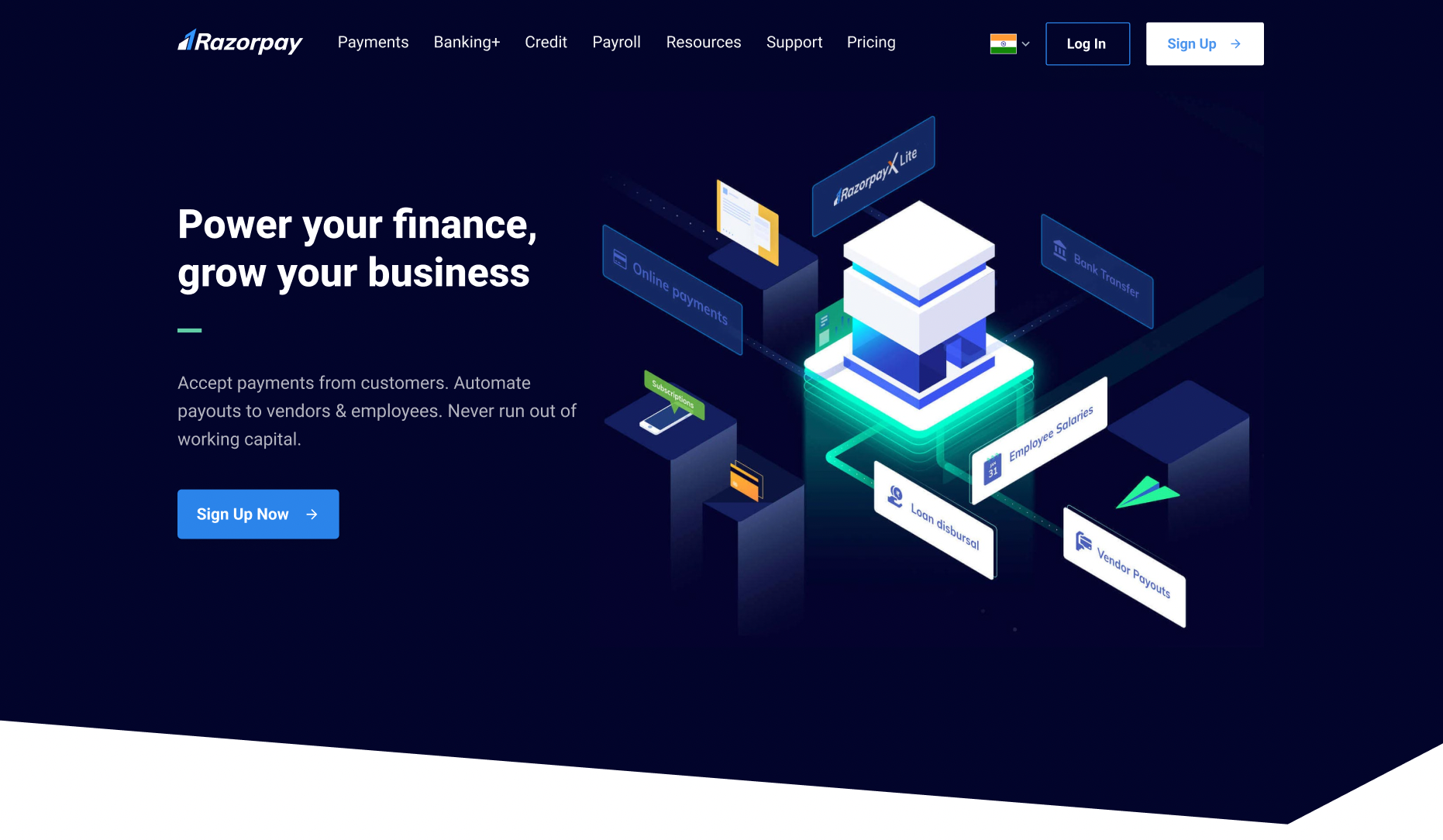
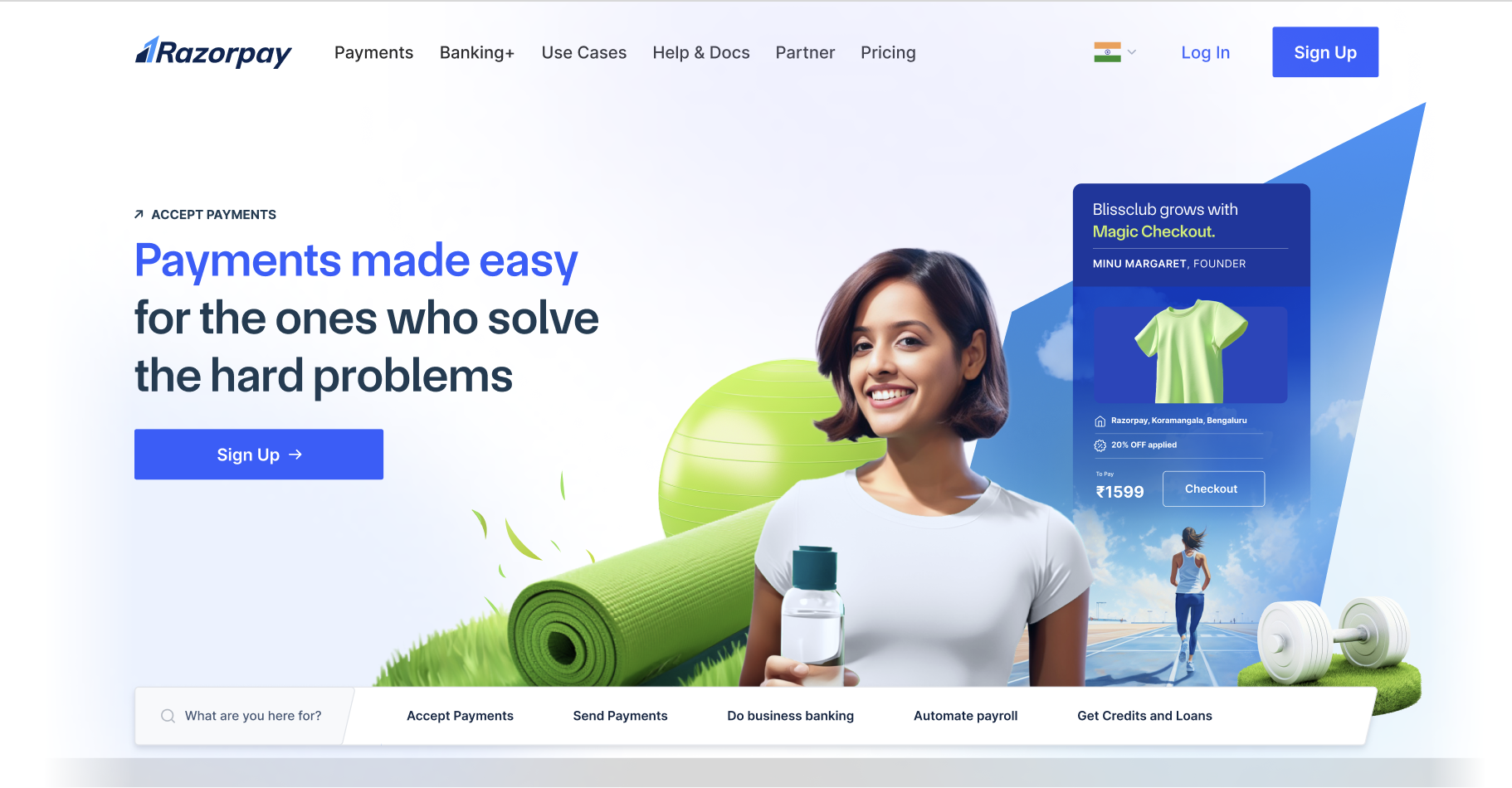
The redesigned homepage needed to explain Razorpay's broader product portfolio to smaller businesses coming online for the first time.
Razorpay · UX research
Evaluative study
I proposed and led a study of Razorpay's redesigned homepage to evaluate whether its visual language, content, and interactions communicated the intended brand and helped smaller businesses understand the expanded product portfolio.
My role
Senior UX Researcherproposal, study design, moderation, synthesis, stakeholder alignment
Timeline
6 weeksNovember 2023
Partners
Product, brand, content, and marketingdesigners and product manager
Methods
Pre-mortem, UX audit, impression, perception, usability, and preference tests
At a glance
The redesigned homepage needed to explain Razorpay's broader product portfolio to smaller businesses coming online for the first time.
Four participant exercises evaluated first impression, visual perception, usability, and comparative preference.
The findings informed changes to product content, interaction design, and the visual system.
Project context
Razorpay was known primarily for its payment gateway and had expanded into neobanking, payroll, and lending. The redesign aimed to communicate this broader product offer and make the company more relatable to smaller, less technically experienced businesses.
I proposed an evaluative study to test brand perception, product comprehension, and usability before launch.
Research questions
We evaluated brand perception separately from visual preference.
We tested what the visual language communicated before participants saw the final copy.
We assessed product discovery, comprehension, and task completion.
Methodology
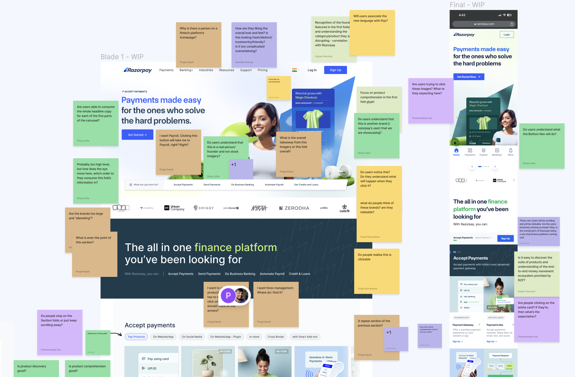
Identify assumptions and possible failure points
Resolve usability issues before fieldwork
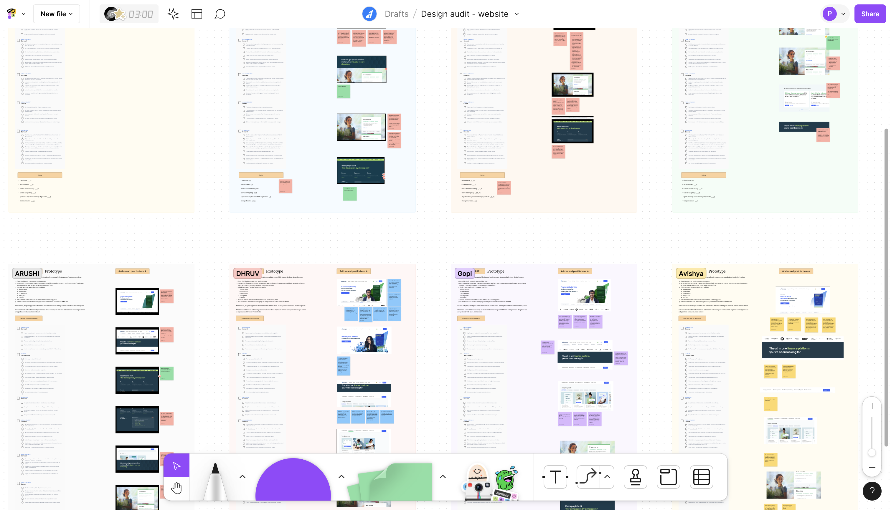
Evaluate perception, comprehension, and usability
01
02
03
A stripped-down first fold appeared for ten seconds, followed by unaided recall to identify what attracted attention.
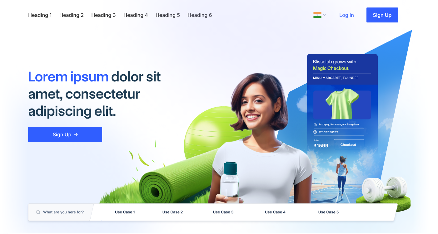
A static site with placeholder copy isolated what the visual language communicated about the company, audience, and brand.
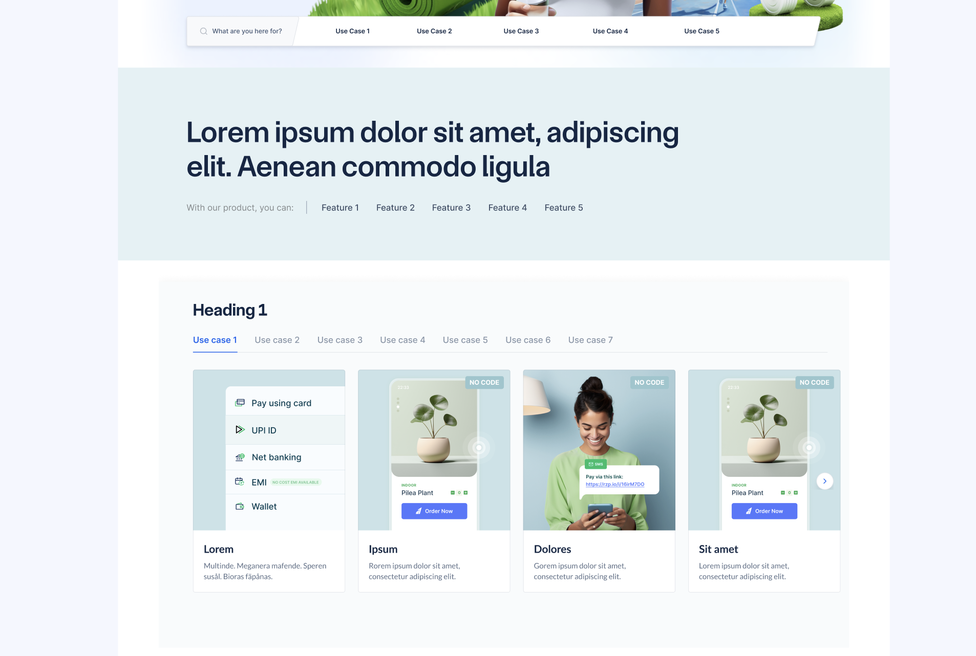
Free exploration and guided tasks tested comprehension, product discovery, brand ratings, descriptors, and the SUS.
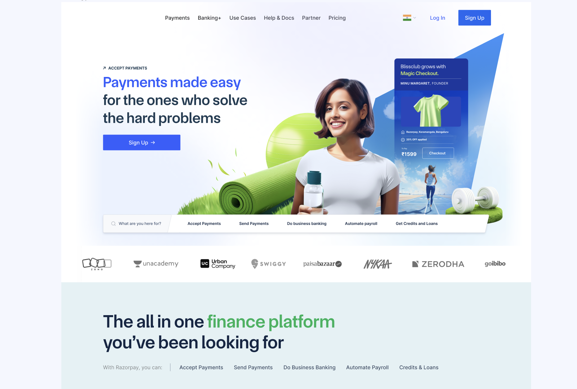
A comparison with the previous website measured perceived improvement and the reasons behind each participant's preference.
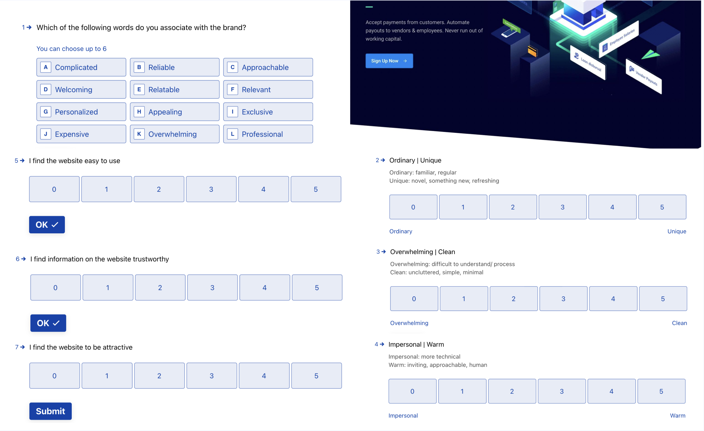
Findings and recommendations
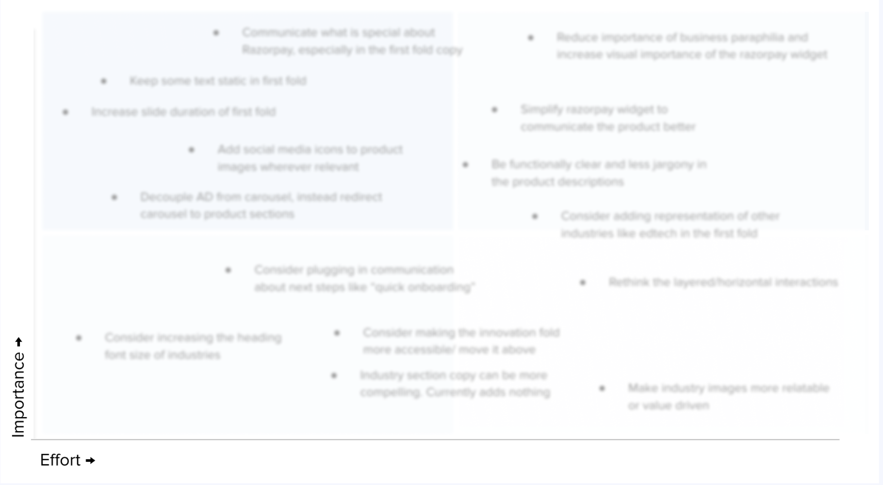
The detailed findings remain under NDA. The recommendations addressed how clearly the homepage communicated Razorpay's expanded product offer and how content and interaction design supported that understanding.
Interaction predictability
Participants were confused when vertical scrolling triggered horizontal movement. We recommended simpler interactions that behaved as expected.
Product comprehension
Participants struggled to understand the expanded portfolio and differences between products. We recommended clearer terminology and content hierarchy.
Product discovery
Task-based testing identified products and calls to action that participants overlooked. We recommended changes to navigation and placement.
Impact
What I learned
Involving cross-functional partners in the design pre-mortem, research sessions, and synthesis helped the team understand the findings and clarified ownership of the recommended changes.